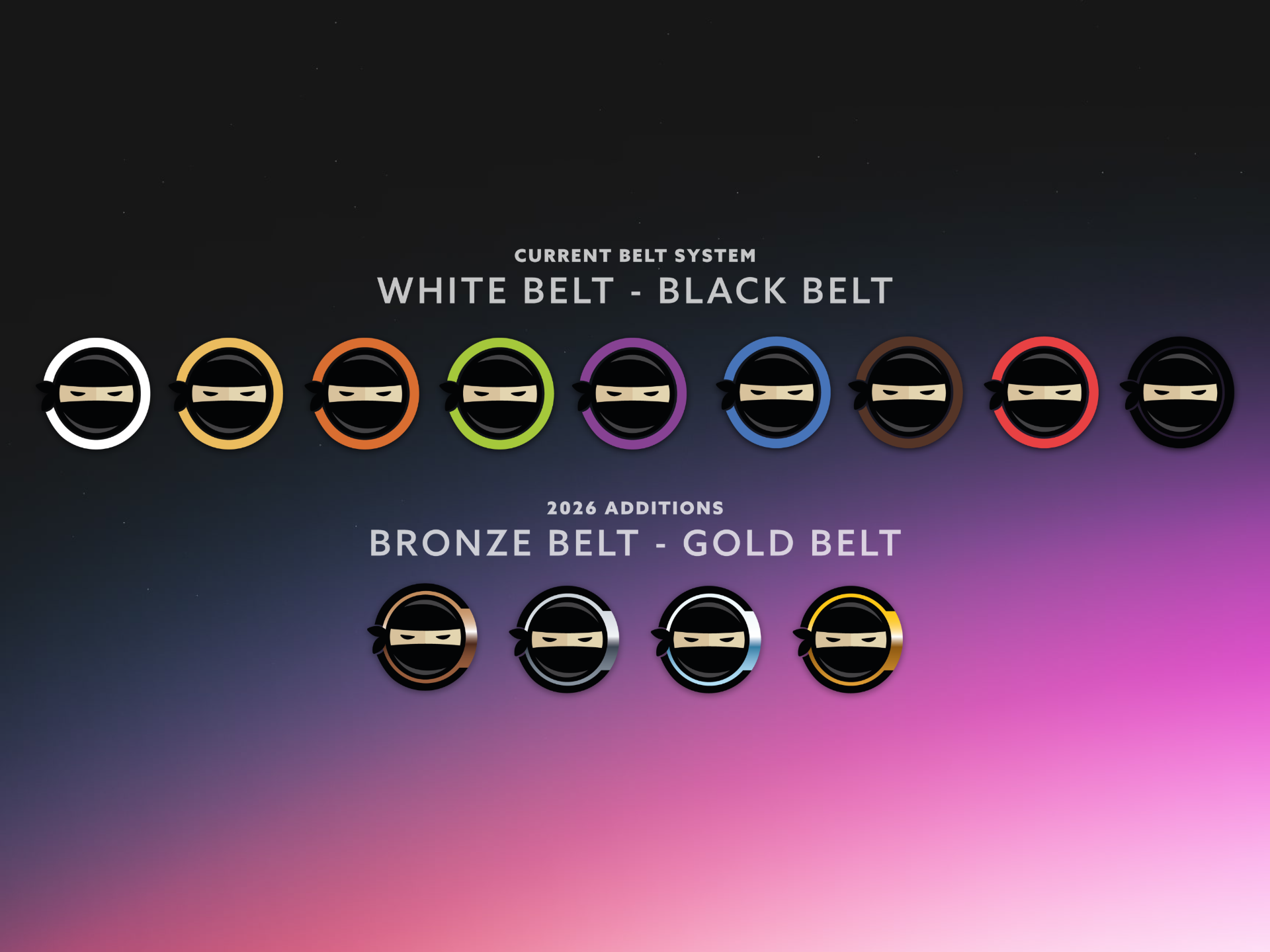
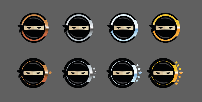
Color selection became one of the project's most important design decisions. Gold needed to feel distinct from Yellow, Bronze couldn't be mistaken for Brown or Orange, and Platinum needed enough separation from Silver while still feeling premium. Every color was evaluated not only individually, but as part of the complete progression students would experience throughout the program.
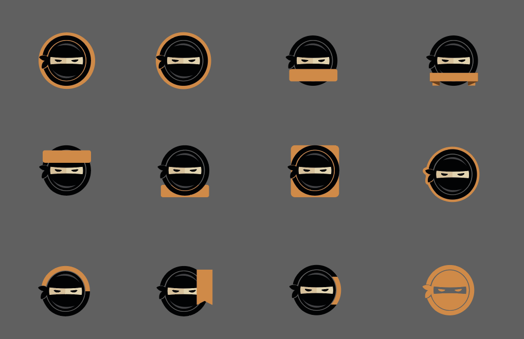
Alongside this, it was important to find a distinguishing accent or color application that made these feel "Advanced" - not just "as well."



.png)
